Resume Fonts: 10 That Print Clean and the Sizes to Use
By Mustafa Tarabya, founder of CVBooster · Published · Updated
7 min read
Ten resume fonts are listed below with the sizes to set them at, checked in September 2026. The short answer is that any of them works and the point size matters more than the name: 11pt body, 12 to 14pt bold headings, and 18 to 24pt for your name, which is the range Microsoft publishes in its own resume font guidance. The constraint nobody tells you is availability, so every font here either ships with Microsoft Word or is free from Google Fonts, because a font your reader does not have gets substituted and your layout moves. Written by Mustafa Tarabya, who hired for his own company, read every application himself and now writes CVBooster's guides.
Here is the spec to use if you want to stop thinking about it.
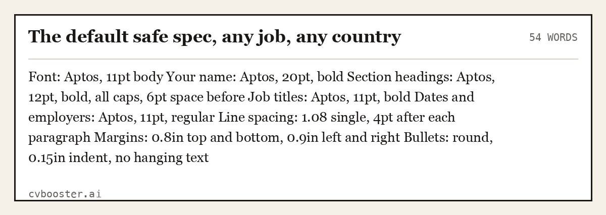
The default safe spec, any job, any country (54 words)
Font: Aptos, 11pt body Your name: Aptos, 20pt, bold Section headings: Aptos, 12pt, bold, all caps, 6pt space before Job titles: Aptos, 11pt, bold Dates and employers: Aptos, 11pt, regular Line spacing: 1.08 single, 4pt after each paragraph Margins: 0.8in top and bottom, 0.9in left and right Bullets: round, 0.15in indent, no hanging text
The ten fonts, and where you already have each one
| Font | Type | Where you have it | Best for | Watch out |
|---|---|---|---|---|
| Aptos | Sans | Default in Word and Microsoft 365 | Anything, and the safest default in 2026 | Very new, so unfamiliar to older eyes |
| Calibri | Sans | Every version of Word since 2007 | Anything | Reads as the corporate default, because it was |
| Garamond | Serif | Word, and free as EB Garamond | Fitting more words on one page | Small x-height, so set it at 11.5 or 12pt |
| Cambria | Serif | Word | Two-page resumes, dense experience | Slightly heavy in bold |
| Candara | Sans | Word | Standing out slightly without risk | Narrow figures, check your dates |
| Georgia | Serif | Word and every browser | Screen reading, large numbers | Wide, so it costs you lines |
| Verdana | Sans | Word and every browser | Accessibility and large print | Very wide, expect to lose a third of a page |
| Lato | Sans | Free, Google Fonts | Clean modern look, embeds well in PDF | Light weights vanish when printed |
| Source Sans 3 | Sans | Free, Adobe open source | Technical roles, long skills lists | Similar 1 and l, check ID numbers |
| Helvetica or Arial | Sans | Mac and Word respectively | Universal fallback | Tight letter spacing at small sizes |
Microsoft's own resume font guidance is worth knowing before you pick: "Aptos is the default font in Microsoft Word and Microsoft 365, replacing Calibri as the modern standard." If you leave a Word document alone, you are already using it.
The sizes, which matter more than the font
| Element | Size | Weight |
|---|---|---|
| Your name | 18 to 24pt | Bold |
| Contact line | 9.5 to 10.5pt | Regular |
| Section headings | 12 to 14pt | Bold, optionally all caps |
| Job titles | 11 to 12pt | Bold |
| Employer and dates | 10.5 to 11pt | Regular or italic, pick one |
| Body and bullets | 10.5 to 11.5pt | Regular |
| Footer or page number | 9pt | Regular |
Microsoft's resume guidance sets the same brackets: use "18 to 24 points" to spotlight a name, "12 to 14 points in bold styling" for headings, and "ten to 12 points" for the body. Going under 10pt to force one page is the single commonest formatting mistake, and it is visible instantly on paper.
Five more complete specs

Classic serif spec, law, academia, finance (51 words)
Font: Garamond, 12pt body Your name: Garamond, 22pt, small caps Section headings: Garamond, 13pt, bold, 8pt space before, thin rule underneath Job titles: Garamond, 12pt, bold Line spacing: exactly 14pt Margins: 1in all round Notes: Garamond's small x-height means 12pt reads like 11pt in a sans. Do not drop below 11.5pt.
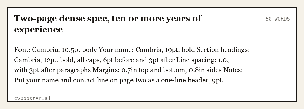
Two-page dense spec, ten or more years of experience (50 words)
Font: Cambria, 10.5pt body Your name: Cambria, 19pt, bold Section headings: Cambria, 12pt, bold, all caps, 6pt before and 3pt after Line spacing: 1.0, with 3pt after paragraphs Margins: 0.7in top and bottom, 0.8in sides Notes: Put your name and contact line on page two as a one-line header, 9pt.
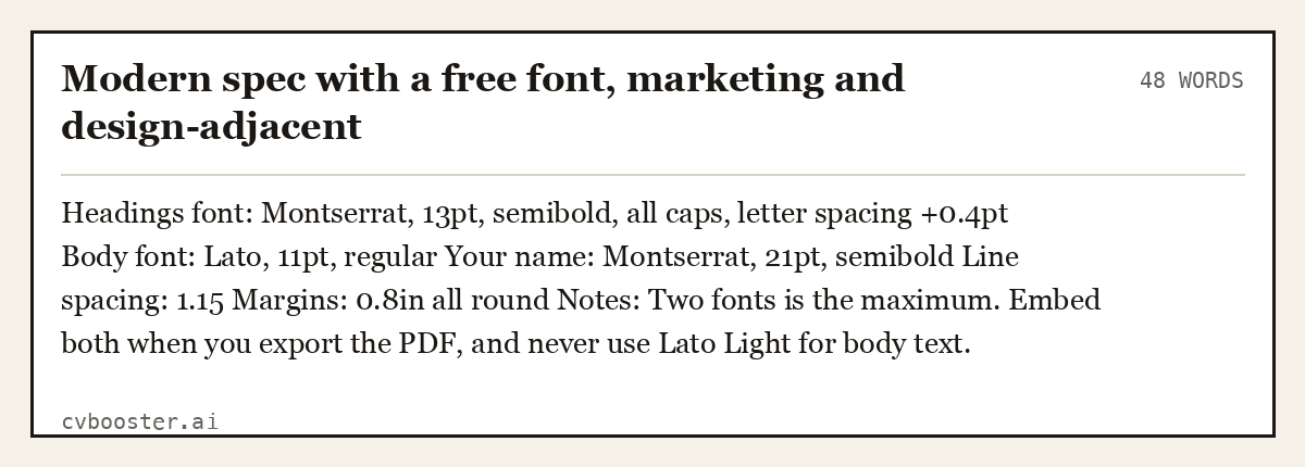
Modern spec with a free font, marketing and design-adjacent (48 words)
Headings font: Montserrat, 13pt, semibold, all caps, letter spacing +0.4pt Body font: Lato, 11pt, regular Your name: Montserrat, 21pt, semibold Line spacing: 1.15 Margins: 0.8in all round Notes: Two fonts is the maximum. Embed both when you export the PDF, and never use Lato Light for body text.
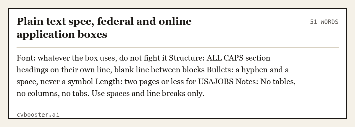
Plain text spec, federal and online application boxes (51 words)
Font: whatever the box uses, do not fight it Structure: ALL CAPS section headings on their own line, blank line between blocks Bullets: a hyphen and a space, never a symbol Length: two pages or less for USAJOBS Notes: No tables, no columns, no tabs. Use spaces and line breaks only.
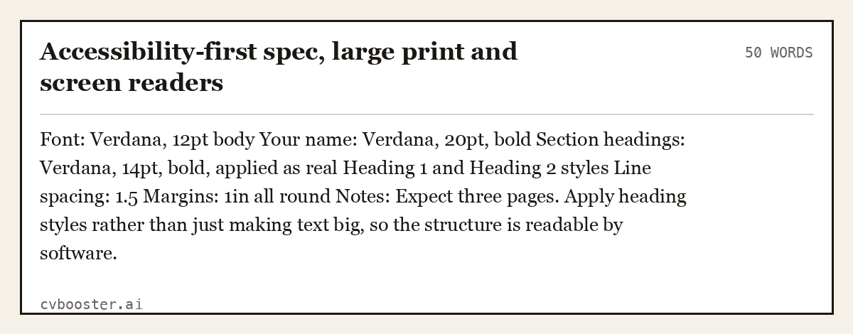
Accessibility-first spec, large print and screen readers (50 words)
Font: Verdana, 12pt body Your name: Verdana, 20pt, bold Section headings: Verdana, 14pt, bold, applied as real Heading 1 and Heading 2 styles Line spacing: 1.5 Margins: 1in all round Notes: Expect three pages. Apply heading styles rather than just making text big, so the structure is readable by software.
The font does not break the parser, the layout does
No applicant tracking system vendor publishes a list of approved typefaces, and any page that claims one is guessing. What actually breaks a parse is text that is not text: a name inside an image, a contact block inside a text box, two columns that interleave when read in order, and headings that are only big rather than structural.
That last one is the fixable part. Section508.gov publishes the authoring guides for creating accessible word processing documents, and its Microsoft Word guides all start from the same instruction: use the built-in heading styles. A resume built with real Heading 1 and Heading 2 styles reads correctly to a screen reader, to a PDF exporter and to a parser, and it costs nothing.
For federal applications there is a hard rule to design within. USAJOBS states that "You must upload or build a resume that is two pages or less", and recommends saving as a PDF "to maintain formatting". Choose your point size to fit that, not the other way round.
What to avoid
- Anything under 10pt, including your contact line. It reads as desperate before it reads as anything else.
- Three fonts. Two is already a decision you have to justify.
- Light and thin weights for body text. They print grey.
- Times New Roman at 12pt with 1in margins, which is the default look of a document nobody edited.
- Comic Sans, Papyrus, Brush Script, and any font with a personality of its own.
- Coloured text other than black or a very dark accent on headings.
- A font you downloaded that the employer does not have, exported as a Word file. Export PDF or do not use it.
Purdue's résumés and CVs section treats fonts as part of page design alongside "using white space, headings, and fonts", which is the right way to think about it: the typeface is one of four levers and the least important of them.
Once the type is set, fix the structure around it with how to make a resume, the resume format guide and resume length. If you are worried about parsing specifically, read what ATS software actually does rather than any page that ranks fonts by ATS score.
Frequently asked questions
What is the best font for a resume?
Aptos at 11pt, because it is the default in Word and Microsoft 365 and therefore present on almost every machine that will open your file. Calibri, Garamond, Cambria and Lato are all equally defensible. No font on that list will cost you an interview.
What font size should a resume be?
11pt body, 12 to 14pt bold headings, 18 to 24pt for your name and 9.5 to 10.5pt for the contact line. Microsoft publishes the same brackets in its resume font guidance. Do not go under 10pt for body text to save a page.
Do applicant tracking systems reject certain fonts?
No vendor publishes a list, and there is no published evidence that a mainstream typeface causes a rejection. Parsing fails on images, text boxes, columns and decorative bullets, not on the choice between Calibri and Garamond. Fix the layout and stop worrying about the font.
Should a resume use a serif or a sans serif font?
Either. Use a serif such as Garamond or Cambria if you need to fit more words, since both are narrower per character than Verdana or Georgia. Use a sans such as Aptos or Lato if the document will mostly be read on a screen.
Can I use two fonts on a resume?
Yes, one for headings and one for body, and no more. Pair a geometric sans such as Montserrat with a humanist sans such as Lato, or pair any sans heading with a serif body. Embed both fonts when you export the PDF.
How do I stop my resume layout moving on someone else's computer?
Export it as a PDF, which fixes the type, and only use fonts that ship with Word if you must send a .docx. USAJOBS recommends PDF "to maintain formatting", and the same logic applies to every employer inbox.
Related articles
- Cover Letter Format: The Perfect Layout & Structure
- About Me Examples: 12 Written for a Resume and a Bio
- Bartender Job Descriptions for a Resume: 8 Examples
- Certification for Office Managers: 6 Lines That Get Read
More articles
- Career Goals on a Resume: Examples & How to Write Them
- Resume Format Guide: Reverse Chronological Wins
- Resume Header: What Goes In, What Stays Out
Looking for a worked example for your job title? Browse the resume examples by job title.