Resume Skills Section: Layout and Placement
By Mustafa Tarabya, founder of CVBooster · Published · Updated
13 min read
The skills section belongs on page one, takes three to five lines, uses labelled groups rather than a long comma run, and is headed with the plain word "Skills". Whether it sits above or below your experience depends on which of the two makes the better first argument for you.
This page is about the block as an object on the page — its position, its shape, its size and its heading. What goes inside it is a separate question, covered in the main guide at which skills to put on a resume.
What is the section actually for?
It is an index, not an inventory. A reader arriving at your resume has a short mental list of things the role needs, and the skills block is where they check that list off in one pass before deciding whether to read your job history properly.
That framing settles most layout arguments. An index is short, ordered by what the reader is looking for, and laid out so the eye can jump. It is not a place to be comprehensive, and being comprehensive is what breaks it.
Where should the skills section go on the page?
Directly under whichever section makes your strongest case. If your job titles already say the right things, the skills block sits below experience and confirms it. If your job titles do not yet match the role you are applying for, the skills block goes above experience and does the arguing. Licensed jobs follow the same logic, which is why our therapy resume examples put the license, setting and caseload above any list of skills.
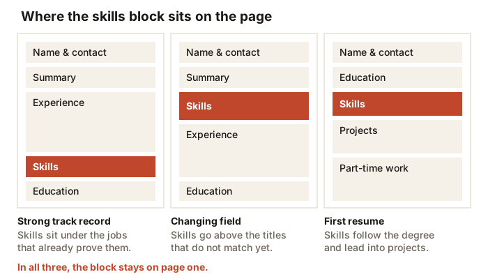
The one rule that does not bend is the page. A skills block on page two of a two-page resume is a block that a reader who stopped after page one never saw, and a reader who stopped after page one is the most common kind.
What shape should the block be?
There are three in common use, and they are not equally good.
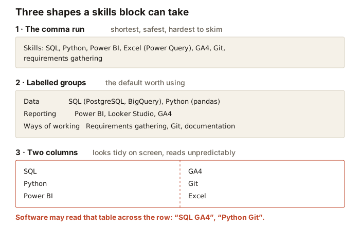
The comma run is the safest thing you can produce, because it is ordinary text in ordinary order. Its weakness is skimming: past about a dozen items the reader stops picking individual words out of it.
Labelled groups fix that. Three or four short rows, each opening with a category word, and the eye lands on the category before the contents. This is the default worth using for most resumes, and it costs one extra line.
The two-column table is the one to avoid. It looks neat in the editor, but if it is built as a table or as two text boxes, software reading the file may take it row by row and produce pairings that were never on your page. Nothing is gained visually that labelled groups do not give you.
Why does the shape matter at all?
Because two different things read the page and they fail in different ways.
A person reads a skills block by jumping, not by scanning left to right. The eye lands somewhere, looks for the word it came for, and moves on within a couple of seconds. Labelled groups give that jump something to land on. A long comma run gives it nothing, so the reader either reads the whole thing dutifully or skips it, and most skip it.
Software reads the file by turning it into a stream of text. Anything that is laid out with a table, a text box, a shape or a column can enter that stream in an order that has nothing to do with how it looks on screen. A row that reads "SQL | GA4" on the page can arrive as the phrase "SQL GA4", and now neither word is where it should be.
Labelled groups happen to be the shape that satisfies both. They are ordinary paragraphs of text, so the stream stays in order, and they have a visual left edge, so the eye has a ladder to climb. That is the whole reason to prefer them — not aesthetics.
Two versions of the same block
Weak, for a candidate applying to a junior data role. "Skills: Communication, Microsoft Office, teamwork, SQL, data analysis, problem solving, Windows, Excel, attention to detail, Python, hard working, time management, Power BI, internet research."
Fourteen entries in one run. Four of them are the ones that matter and they are buried between the ones that do not, which means the reader has to do the sorting the writer should have done.
Rewritten. "Data: SQL (PostgreSQL, BigQuery), Python (pandas), Excel (Power Query, pivot tables). Reporting: Power BI, Looker Studio, GA4. Ways of working: requirements gathering with non-technical stakeholders, documentation, Git."
Three lines instead of two, and it holds fewer entries than the original. It reads faster because the labels give the eye somewhere to stop, and because everything a reader would have discarded has already been discarded for them. These are example lines rather than a real applicant's.
How many lines should it take?
Three to five for most people. Enough for three labelled groups plus a wrap. Below three lines the section is usually thin enough that the reader wonders what you left out; above five it stops being an index and becomes a paragraph, which is the thing an index exists to avoid.
If the section is running long, the problem is almost never the formatting. It is that entries which belong in your experience have leaked into the list, or that you are hedging by including everything you have ever touched.
What should the heading say?
"Skills". If you need to be more precise because you have two blocks, "Technical Skills" and "Certifications" are both clear. "Core Competencies" is acceptable in fields that already use the phrase.
What to avoid is the invented heading. "My Toolkit", "What I Bring", "Superpowers". They cost a reader a second of translation, they are harder for parsing software to categorise, and they set a tone most hiring processes are not asking for.
Tip: Format the heading exactly like your other section headings — same size, same weight, same spacing above it. A skills heading styled differently from Experience and Education reads as an afterthought bolted on, which is usually what it is.
What are core competencies on a resume?
Core competencies on a resume are the five to nine abilities the job depends on most, listed under a heading of that name near the top of the page. In practice it is a skills section with a different label, and it works the same way: short entries, in the words of the job posting, each one proved somewhere in your experience. You will meet the phrase in some job postings, and that is the best reason to use it as your heading: it mirrors the reader's own words.
What is core competencies in a resume, then, compared with skills? Skills can be any tool or task you can do. Core competencies are the short list that defines your level in the role you want. A project coordinator who can use ten tools still has only a handful of competencies the next employer will hire for. Here is a block written out for an invented candidate, Priya Raman, applying for a senior project coordinator role:
- Core Competencies
- Project scheduling: plans for jobs with four to six subcontractors, kept in MS Project
- Budget tracking: monthly cost reports against the approved budget
- Stakeholder communication: weekly client updates and site meeting minutes
- Risk and change control: change log, sign-off routing, issue escalation
- Procurement: quotes, purchase orders and delivery follow up
- Team coordination: onboarding and daily task lists for site assistants
Six entries, each a noun phrase with a short proof after the colon, and every one of them reappears as a bullet with a result in the experience section. If an entry has no bullet to back it, cut it. Use either "Core Competencies" or "Skills" as the heading, never both, so the reader and the parsing software see one block.
How do you choose the group labels?
Take them from the job ad. If the ad splits its requirements into technical skills and clinical systems, use those two words as your labels and the reader is matching against their own structure without effort. Regulated industries work the same way: our pharma resume examples label skills by quality framework, such as GMP and GCP, because that is how the postings are written.
- Two to four groups. Five is a filing cabinet, one is a comma run with extra steps.
- Put the group the ad cares most about on the first line.
- Label by kind, never by confidence — "Expert" and "Familiar" as group names invite the wrong questions.
- Keep labels to one or two words so the rows stay aligned and the eye can jump down the left edge.
- Use the same separator throughout: commas within a group, and one consistent character between groups.
Does the section change with the resume format?
In a reverse-chronological resume — the standard — skills are a supporting block, usually below experience, and their job is confirmation.
In a skills-based or functional layout the block moves to the top and expands, with short evidence lines grouped under each skill heading rather than a bare list. That layout is worth using carefully, since some readers treat it as a signal that something in the chronology is being hidden.
In a hybrid, the compromise most career changers end up at, a compact grouped skills block sits directly under the summary and the full chronological history follows underneath it, unaltered.
What about templates with a sidebar?
Sidebars are the most common way a good skills section disappears. The column is usually a text box, a table cell or a shape, and any of those can be read out of order, read after the main column, or skipped when the file is processed as text.
If you like the look, keep it for the version a human receives directly and keep a single-column version for everything submitted through a portal. If you would rather maintain one file, keep the single-column one — it loses less.
Does the block change for different situations?
The rules of shape do not change, but the size and position do. Creative and production roles show it clearly: the skills block in each of our producer resume samples names the budgeting, scheduling and editing tools of that medium.
A first resume. The block sits high, usually under education, and it can afford to be one line longer than a senior one because it is carrying more of the argument. Keep the groups honest: a "Coursework and projects" label is a legitimate group name and it is more truthful than folding a semester's tools in among things you have used at work.
A career changer. The block moves above experience and the group labels come from the target field rather than the current one. This is the one situation where a slightly larger block is worth the space, since it is doing the work your job titles cannot do yet.
A return after a break. Keep the block at its normal size and let dates do the reassurance. A skills section that suddenly balloons is a signal that something below it is being compensated for.
A senior specialist. The block can run longer where the tools genuinely are the job, but it should get more grouped, not less. Five labelled rows of four entries reads faster than twenty entries in a run, even though the word count is identical.
A two-page resume. The block belongs on page one regardless of what else has to move to make room. If the only way to fit it is to cut something, cut the oldest job's bullets rather than the block.
What order should the entries go in?
Relevance to this ad, first to last, both between the groups and inside them. Not alphabetical, which sorts by an accident of spelling, and not chronological, which puts the thing you learned most recently in front of the thing you are best at.
The practical test: read the first six words of your skills block and ask whether they are the six words the ad would have chosen. If they are not, reorder until they are. That is a two-minute edit per application and it is the highest-value change you can make to the section.
How does it sit next to the summary?
They should not say the same thing twice. The summary is prose and makes an argument: who you are, at what level, aimed at what. The skills block is a list and supplies the specifics. If your summary already names five tools, it has taken the skills section's job and both are now weaker.
A practical division: the summary names at most one or two things, the ones you want read first, and the block carries the rest.
How do you check the block survived?
- Export the finished file, open the PDF, and select the skills block with your cursor. If you cannot select it as text, it is a picture.
- Copy the whole resume and paste it into a plain text editor. Read the skills lines in the order they arrive.
- Check the group labels are still attached to the right contents after that paste.
- Look at the page break. Nothing in the block should straddle it.
- Print one page in black and white. If a colour bar or a shaded cell was doing the structural work, you will see it vanish.
A skills section that passes those five checks is doing everything a layout can do for you. What remains is the content — which skills earn a place, in whose words, and how each one is proved further down the page. That is the subject of the main guide at which skills to put on a resume, with the two halves of the list covered at hard skills and soft skills.
Related articles
- Best Resume Format: Chronological vs Functional vs Hybrid
- Hard Skills for a Resume: How to List Them
- How to Use a Resume Example Without Copying It
- Resume Format Guide: Dates, Layout, Color and File Type
More articles
- Resume Summary Examples: 12 Opening Statements by Level
- Resume Objective vs Summary: Which to Use, With 8 Examples
- Resume Synonyms: Better Words for 10 Tired Resume Verbs
Looking for a worked example for your job title? Browse the resume examples by job title.