Modern Resume: what it actually means, and what it does not
By Mustafa Tarabya, founder of CVBooster · Published · Updated
11 min read
A modern resume is one that follows current conventions and reads cleanly on a screen. It is not a two-column template with a dark sidebar, circular skill ratings and a headshot. That look is sold as modern because it is easy to sell, and it is the single riskiest thing you can do to a document that has to be machine-readable.
The confusion is understandable. Search for a modern resume and you get galleries of layouts, so the word arrives attached to a visual style. But the things that have genuinely changed about resumes in the last decade are almost all changes to content and convention, not to graphics.
What has actually changed?
These are the differences between a resume that reads as current and one that reads as though it has been in a drawer since 2010. None of them requires a designer.
- The objective statement is gone. "Seeking a challenging position that utilises my skills" told the employer what you wanted. A professional summary tells them what you bring, in three or four lines.
- "References available on request" is gone. It was always assumed, and it spends a line saying so.
- The full street address is gone. City and country answers the only question anyone had.
- Links have arrived: LinkedIn as standard, a portfolio or code repository where the field expects one.
- Location has become a real field again, because remote and hybrid arrangements made it ambiguous. Say where you are and what you are open to.
- Bullets describe outcomes rather than duties. What changed because you were there, not what your job description said.
- Tailoring per application has become the default rather than the exceptional effort, because the same document sent to twenty employers matches none of them.
- The file is a PDF, exported from a real document, unless the employer asks for something else.
That list is what "modern" means. Every item is about what the page says and none of it is about how the page looks.
Why does heavy design cost you the parse?
Because a designed layout and a text stream are two different things, and the software reading your file only gets the second one. When a document is processed, what comes out is a sequence of text in the order the file stores it, which is not necessarily the order your eye reads it.
A single-column resume has one obvious order, so this problem never arises. A two-column resume has two, and the extraction may interleave them. Everything in a sidebar can end up shuffled through everything in the main column.
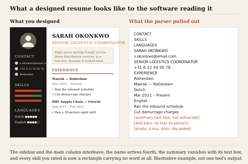
The other losses are simpler. A skill bar is a rectangle: it holds no text, so whatever it was rating arrives with no rating attached, or does not arrive at all. Icons standing in for labels carry no words. Text placed inside a shape or a text box may sit outside the main text flow entirely. Anything rendered as an image contributes nothing.
You do not need to know which system a given employer uses to avoid this. The choices that cause the damage are a short and specific list, and none of them is load-bearing for how good your resume looks. The wider mechanics are in ATS resumes in 2026.
Tip: Test any template before you commit to it. Open the exported PDF, select all, copy, paste into a plain text editor, and read what comes out. If your name is not near the top and your sections are not in order, that template is costing you more than it is giving you.
What a linear reader does with a text box
"Do not use text boxes" is repeated everywhere and explained almost nowhere, which makes it easy to dismiss. The mechanism is worth four minutes, because it generalises to every layout decision you will make.
Start with the file formats. A PDF does not store a document in the sense you are imagining. It stores a content stream: a series of operators that place glyphs at coordinates on a page. There is no paragraph, no column, no reading order, unless the file was produced with tagging that describes the structure explicitly. Most resumes are exported without meaningful tagging.
Extraction therefore has to reconstruct the order. It does this from geometry: group glyphs into lines by their vertical position, group lines into blocks, then decide which block follows which. That reconstruction is a heuristic, and heuristics have failure modes.
A single-column page gives the heuristic nothing to get wrong: one block per line, top to bottom. A two-column page gives it a genuine ambiguity, because a line of text in the left column and a line in the right column sit at the same vertical position. Read down each column and you get the document you designed. Read across each row and you get the sidebar interleaved through the main content, which is exactly what the figure above shows.
A text box or a shape with text inside it is worse, because in a Word document it is not part of the main body flow at all — it is an anchored drawing object with its own text content, sitting outside the paragraph sequence. Extraction that walks the body may skip it entirely. That is how a professional summary placed in a tasteful shaded box vanishes from the extracted text while remaining perfectly visible on screen.
Tables are a milder version of the two-column problem. A table used for genuine tabular data is usually fine. A table used invisibly to lay out a page — borders switched off, cells holding a job title on the left and dates on the right — is a grid the extraction has to linearise, and it may do so cell by cell across each row, separating things you intended to be read together.
Headers and footers are the last one. In a Word file they live in separate parts of the package, referenced from the section properties rather than sitting in the body. Anything you put there can be missed completely, which is why a contact block in the page header region is the most expensive layout mistake available.
Tip: The general rule that falls out of all this: information that matters must exist as ordinary text, in the ordinary flow, in one reading order. Everything else — colour, spacing, rules, weights, sizes — is free, because it does not change the text stream at all.
Before and after: the same person, two layouts
Take the example from the figure. The designed version has a dark sidebar carrying a photo, three contact lines behind icons, three skill bars and two language rating rows, with the name, a summary in a shaded box and two jobs in the main column. It is a competent piece of design and it looks current.
Extracted, it produces the sidebar headings first, then the name fourth, then an interleaving of email, job title, phone number and city, with the summary missing, three skills reduced to nothing, and two language levels reduced to the words Dutch and English with no proficiency attached. A recruiter searching that database for a Dutch-speaking logistics coordinator with warehouse management system experience may not find her, and she will never know.
The rebuilt version keeps every visual decision that was free and drops every one that was not. Single column. Name at 22 point, section headings at 13 in the accent colour with a thin rule beneath, body at 10.5. The summary becomes three lines of ordinary paragraph text directly under the header rather than sitting in a box. The contact icons become the details themselves. The skill bars become a line reading "Warehouse management: SAP EWM, Manhattan WMS", which says more than any bar did. The language dots become "Dutch (native), English (fluent), German (working proficiency)".
It is a plainer page and it carries more information, because every rating that was a picture is now a fact. That trade — a graphic replaced by the words it was standing in for — is the whole of modern resume design in one move.
Four readers, four right answers
"Modern" is not one target, because what a document has to prove changes with the field.
The graphic designer
Two documents. A typographically confident single-page PDF, sent when a human being receives the file directly, where the layout is a work sample and restraint reads as skill rather than timidity. And a plain single-column version for portals and recruiter databases. The portfolio link appears prominently on both, because the portfolio is where the actual argument lives.
The software engineer
Plainest of all four, and deliberately so. One column, no colour beyond perhaps one accent, and a technologies line written as words rather than logos. What reads as modern here is the content: outcomes with scale attached, the systems named exactly as the industry names them, and a repository link that opens onto something maintained.
The nurse or teacher
Modern here means the gating information is easy to find. Registration or qualification status, its number and its renewal date, near the top rather than buried on page two. Mandatory training with dates. Design contributes almost nothing; what contributes is a structure that lets a reader confirm eligibility in fifteen seconds and then read the rest.
The career changer
The most content-dependent of the four. What makes this document current is a summary that names the target role and the transferable through-line explicitly, a skills block placed high because the job titles do not match yet, and bullets rewritten in the vocabulary of the destination field rather than the origin one. A designed template does nothing for this problem, and the space it consumes is space the argument needed.
Where is visual design genuinely expected?
There are fields where the resume is itself a work sample, and in those the calculus changes. Graphic design, art direction, illustration, motion, UI and product design, and some advertising and architecture roles all fall here. A visually inert resume from a designer is evidence about the designer.
Even there, the standard practice is two documents rather than one compromise. A designed version to send when a human being is receiving the file directly, and a plain single-column version for the online application form and the recruiter's database. The portfolio carries the visual argument; the resume carries the record.
Outside those fields, a heavily designed resume does not read as creative. It reads as a template, because the reader has seen the same one that week from someone else.
What does a modern resume look like on the page?
Restrained, and specific. Design still matters — it is just that the useful design decisions are typographic rather than decorative.
- One column, top to bottom. This is the decision that protects everything else.
- One typeface, or two at most: one for headings and one for body. Any competent system font is fine.
- Body text at 10 to 12 point, headings a step or two larger, your name larger again.
- Generous white space, achieved with margins and space between sections rather than with blank paragraphs.
- One accent colour used sparingly for section headings or a rule line, and black or near-black for everything you need read.
- Standard section headings a reader and a parser both recognise: Experience, Education, Skills.
- Consistent alignment throughout. Left aligned is safe; centred body text is not.
- No text boxes, no tables for layout, no icons replacing words, no images carrying information.
White space is the part people underrate. A page with clear margins and real gaps between sections looks contemporary in a way that no amount of colour achieves, and it costs nothing at the parse.
Does AI-written text read as modern?
It reads as generic, which is the opposite of what a resume is for. Generated bullets tend to arrive fluent, evenly weighted and free of anything specific — the systems you used, the size of the team, the number that changed, the constraint you worked around. Our guide to the main purpose of a resume shows what a resume is for, with six complete examples.
That is a content problem rather than a technology problem, and it is fixable in the same pass. Use a tool to get a draft and to catch what you left out, then put the specifics back in yourself. The details you would only know from having been there are the only part of a bullet that cannot be written by someone who was not.
So what should you actually change?
If your resume already exists, modernising it is an afternoon of content work and about twenty minutes of formatting.
- Replace the objective with a summary written for one specific job.
- Delete the street address, the references line, and the list of software everyone uses.
- Add your LinkedIn, and a portfolio link if your field expects one.
- Rewrite the top five bullets so each one names an outcome rather than a duty.
- Collapse any second column back into one.
- Remove skill bars, rating dots and icons, and write the same information as words.
- Standardise the dates, the bullet styling and the section headings.
- Export a fresh PDF and run the copy-and-paste test on it.
The result will look plainer than the templates you were comparing it against, and it will do more work. A modern resume is not a modern-looking resume: it is a current one, written for a specific job, on a page that anything reading it can actually read. If you are still deciding the underlying structure, the resume format guide covers that choice.
Related articles
- Resume Icons: When to Use Them and 5 Clean Examples
- ATS Resume: how to get past the screener, in its own words
- Google Docs CV Template and Resume Templates: the catch
- Accounting Executive Resume: 5 Examples by Career Level
More articles
- Nanny Reference Letter: 7 Samples for Parents and Employers
- NHS CV Template: Free Layout and 6 Examples by Band
- NHS Interview Questions and 15 Full Answers, Band 2 to 6
Looking for a worked example for your job title? Browse the resume examples by job title.